Saturday, July 23, 2011

Chapter Four: Fabrics and Threads-Colouring and Bonding

Pics 1 and 2


I


Hi Sian, I love my basket of dyed and painted fabrics and threads, although the colours are more muted than I thought they would be.

I think this is because I hand painted the calicos and silks. The muslins are stronger in colour because I dip-dyed them.

I hand-painted the perle threads when they were dry as I wanted to keep the colours strong and bright.

Method: Fabrics and threads were first soaked in a warm soda solution to act as a fixative. I dried the fabrics before painting them although I did mist some of the samples first so the dyes would blend.

I made up the seven colours of the rainbow from Procion MX dyes, Magenta, Lemon Yellow and Turquoise. I painted the calico and silk with sponge brushes and used artist brushes for the threads.

Ref: Helen Deighan. Dyeing in Plastic Bags. Crossways Patch 2001. Thanks also to Textile Artist Helen Howes who I first met at a Guild meeting and who subsequently showed me how to successfully space-dye threads and fabrics. www.helenhowestextiles.co.uk


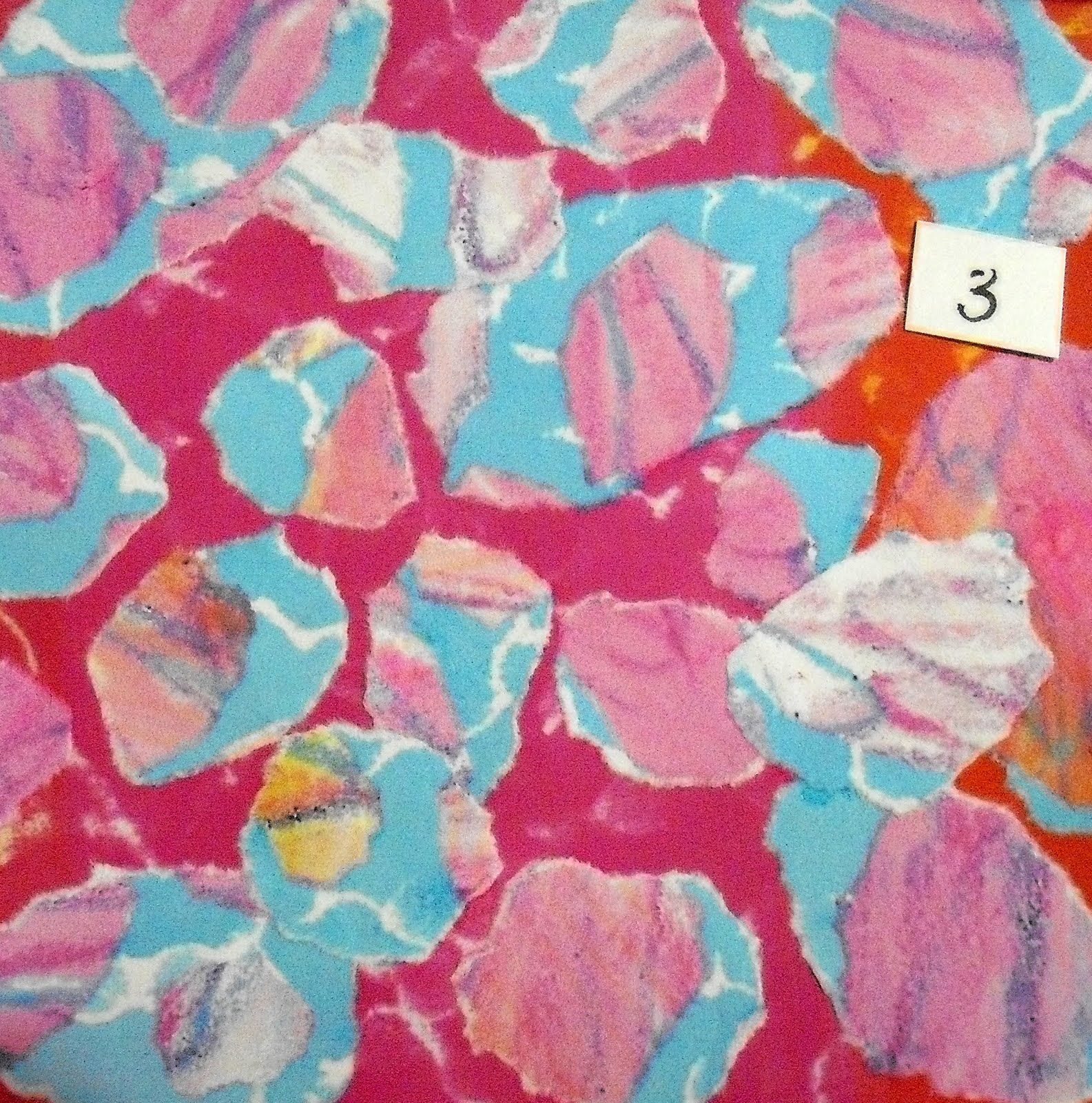
Pic 3: Muslin and silk

Bonding: An awkward technique, the bondaweb kept tearing. The most successful was the red oil pastel circles and sponged gold acrylic on silk.


Pic 4


Pic 5 and 6


Pic 7


Pic 8


Pic 9


Wednesday, May 25, 2011

Chapter Three: Free Machine Stitchery


Tester Sample
I did my presample trials on this piece to test tension and thread weights. I include it because it's my favourite.


Straight Stitch
I used silk and rayon machine embroidery threads plus gold.

Settings
Metalfil needle 80/12
Feed dogs down
Stitch width & length 0
Normal tension


Zig Zag Stitch
I used a mix of threads in rainbow colours and the same bobbin colour and thread.
I used straight and zig zag stitches varying the width of the zig zag.
Row 5: I experimented with trapped threads.
I particularly liked the green thread spirals in row 4, square 1. I layered these in the multicoloured centre square.


Whip Stitch
I changed bobbin case to one with a looser tension.
I also changed machines and used a looser tension.
I used straight and zig zag stitches.
I used machine embroidery thread in rayon and silk.


Cable Stitch
I used the loose bobbin case and a loose tension.
I used a mix of threads in rainbow colours and varied the bobbin colour. I particularly liked the fine red perle with green bobbin thread in square 1 (top left)
I used straight and zig zag stitches.

Row 1: (left to right) perle, tapestry wool, perle
Row 2: tapisserie yarn, stranded cotton, soft embroidery thread
Row 3: hand-dyed silk slub, space-dyed boucle, perle
Row 4: soft embroidery thread, perle, tubular rayon
Row 5: Hand-dyed yarn, tapestry wool, cotton 4 strands

Friday, February 18, 2011

Hi Sian

I've attempted three designs using clouds, sunset and a rainbow as my starting point.


Clouds

Details of the cutting process below.


Clouds shapes outlined in this picture of big skies over Lowestoft.


Torn cloud shapes using oil pastel frottage and brusho papers.


No 2, photocopied, torn into similar shapes and rearranged on a background paper.


Rainbow paper
I based this design on the sequence of colours in a rainbow. Details of the cutting process are below.

You can see how repeatedly photocopying between each process, reduces the vibrancy of the colours. In fact, my printer was starting to run out of ink and you can see the dramatic effect of this in the sunset designs a bit further on.


2 Photocopies of bleach discharged papers cut into strips and arranged at a slight angle in rainbow sequence.


3 is a photocopy of 2, cut into long, thin triangles across the strips and flipped.


4 Rainbow paper
Photocopy of 3, cut into long thin triangles and flipped in no particular order.


1 Sunset with the extracted shapes that I used in this design. I had to modify the size of the ovals to make it work. I tore the shapes to simulate the fuzzy edges around the sun.


2 Sunset shapes torn in orange oil pastel frottage paper and placed on a blue background.

At this point, the colour ink on my printer started to fade and the background should have been green.

Below, you will see that deep red papers came out in a gorgeous magenta. I liked the blue and magenta together, so continued to use them.


3 is a photocopy of 2 with sunset shapes extracted and placed on a red background


4 is 3 on a blue background ready for photocopying


5 is 4 photocopied, cut into strips and flipped


6 is 5 photocopied, cut into squares and rearranged on a blue background


7 is 6 photocopied, cut into strips and flipped


Collage with oil pastel resist and bleach discharge papers

... inspired by life's quirky details with titles extracted from quirky bible verses.


Iwent slightly off-piste here... I love the oil pastel frottage and bleach discharge papers. I taught simple bookmaking and collage to our church craft group and made some quick samples using offcuts of my decorated paper on white card.

I liked the rainbow colours on white so I've started to design a range of notelets using this technique.

They look lovely pegged along my studio wall. I think they may also work as small embroideries, bunting or perhaps a quilt. Here are the titles, I couldn't caption them beside the relevant image for some reason... all 9cms x 9cms.


watch in hope
press on
my sheep
in my heart
flowers appear
even the sparrow


Thursday, December 23, 2010

Chapter One, Drawing Methods

Hi Sian, I attempted scans this time. Let me know if this is better. In keeping with the conservation them, I've used and reused paper I've had lying around for ages and mounted my samples on lovely strong pages from an old atlas.


1A Colour studies: I took my colour inspiration from this wonderful picture of a rainbow taken by my brother in Africa. The painting on the left is by Turner.


1B Wonderful wax crayon and gold markal: The wax crayon buffs beautifully. I particularly liked the impressionistic effect of the dashes in seven rainbow colours.


1C Coloured pencils and felt tips: I like the delicate marks that the coloured pencils make. The sunset was very golden so I've used gold markal and a gold gel pen as well.


1D: Oil pastel and coloured pencil: I loved the oil pastel. Great effects when blended with a cotton bud or kitchen roll, eg the blue and yellow circles blended to a lime green background and the red and yellow to an orange.

I also experimented with oil pastel transfers, ie placing the oil pastel drawing face down on another piece of paper and then drawing into the back of it. I read about this technique in a back issue of Cloth, Paper, Scissors.

A Fine Line. Using a line drawing as a starting point for collage. Emma Jane Fashokun. September/October 2008 Volume 20.


1E: Wax crayon frottage over sequin waste: I was intrigued how just using the crayon at different angles produced very different marks. I particularly liked the wavy diagonal lines.


1F: Gold markal and oil pastel over sinamay: I thought the sinamay frottage gave a lovely representation of ripples.


1G Oil pastel over string block. Very effective over buffed gold markal.


1H Sgraffito: A knitting needle made a great sgraffito tool. Red oil pastel over buffed gold markal was particularly effective.


1I Oil pastel resist with Brusho is a revelation. I love the vibrant colours, chalky finish and serendipitous patterns.


1J Brusho discharged with bleach: My favourite tool is a date serving fork left over from Christmas which makes lovely swirly marks.


1K & L Transparent surfaces: Acrylic paint on tracing paper makes lovely mono prints on acetate. When held up to the light they cast delicate shadows which remind me of the work of Marian Bijlenga. I've chosen her as one of my Artist Studies. Here is a link to her website.


Wednesday, September 08, 2010

Module 6 Creative Conservation


Research Images 1-3 show pictures of Lowestoft and Walberswick in Suffolk. Photographers: me and Ray or should that be Ray and I. We went 'crabbing in Walberswick. I like the reflections in this image.

The wonderful sunset, rainbow and silhouettes were taken by my brother Mikes in Capetown, South Africa.